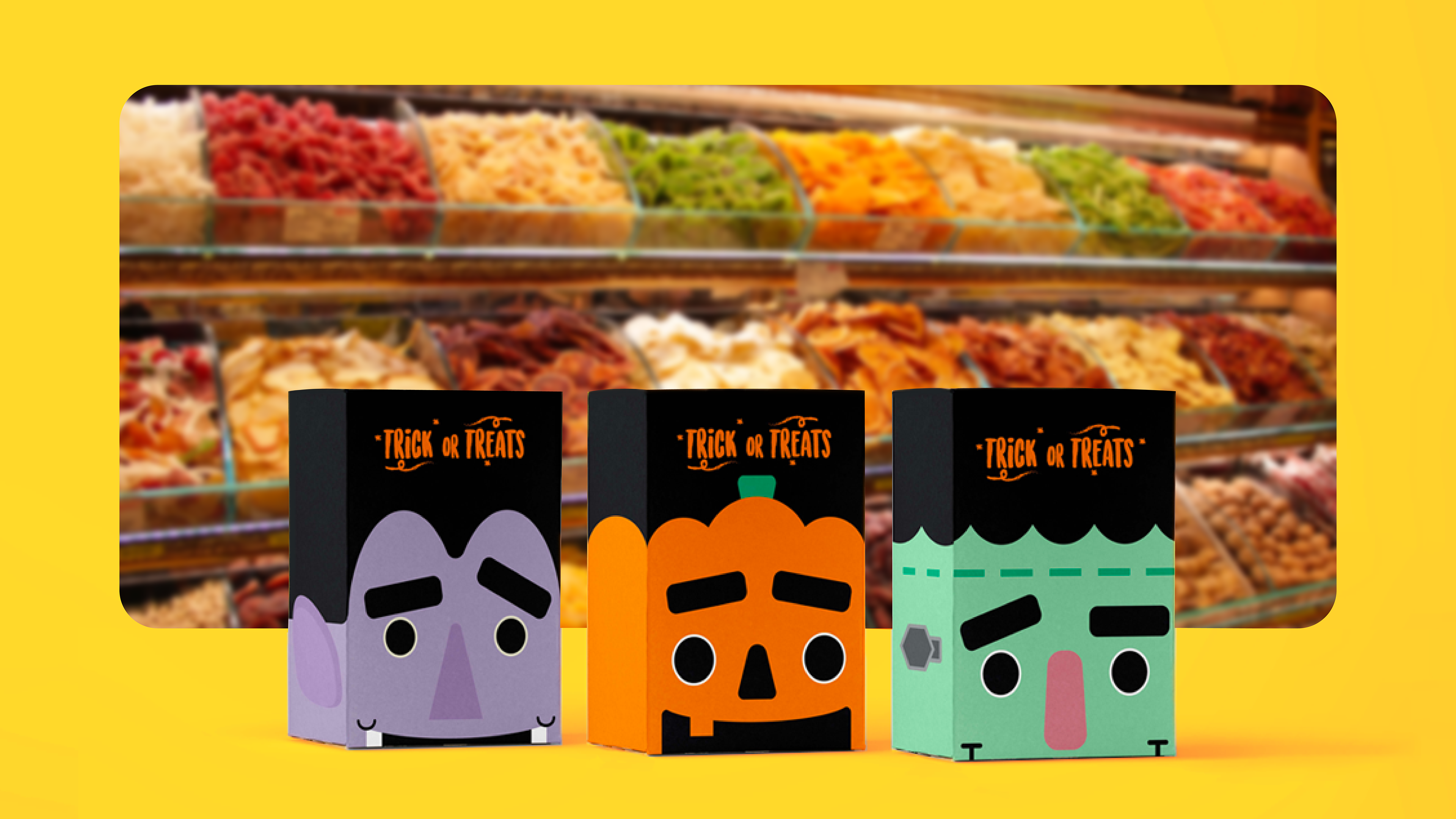
TRICK OR TREATS
THE BRIEF
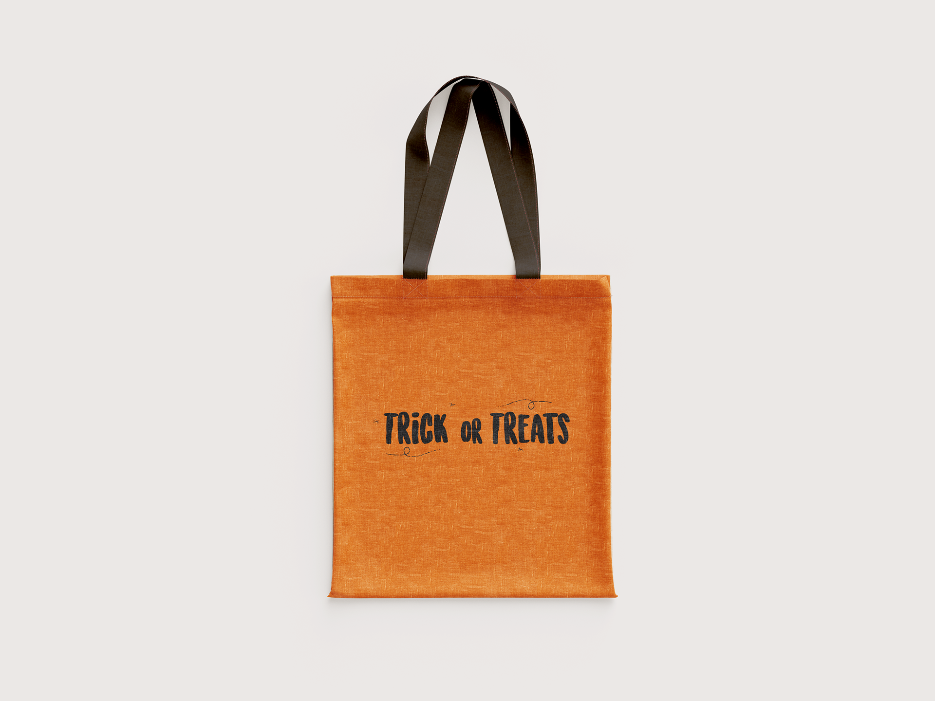
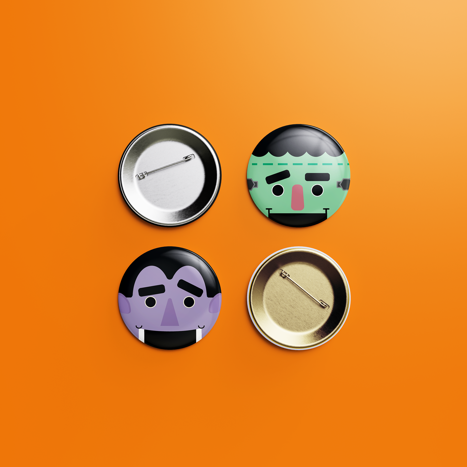
Halloween is one of the biggest holidays of the year where large amounts of unhealthy snacks are consumed. In particular, children are the main market when it comes to the promotion of chocolates and candy. In order to shift this trend towards a healthier and more sustainable diet, Trick or Treats was designed to encourage children to swap out their candies for dried fruits and nuts. Designed in a series, Trick or Treats boxes are placed beside snack bins at grocery stores for shoppers to use in substitute of plastic carrier bags.
This project was awarded a Distinction Award in the Student Packaging Category by the Australian Graphic Design Association (AGDA).
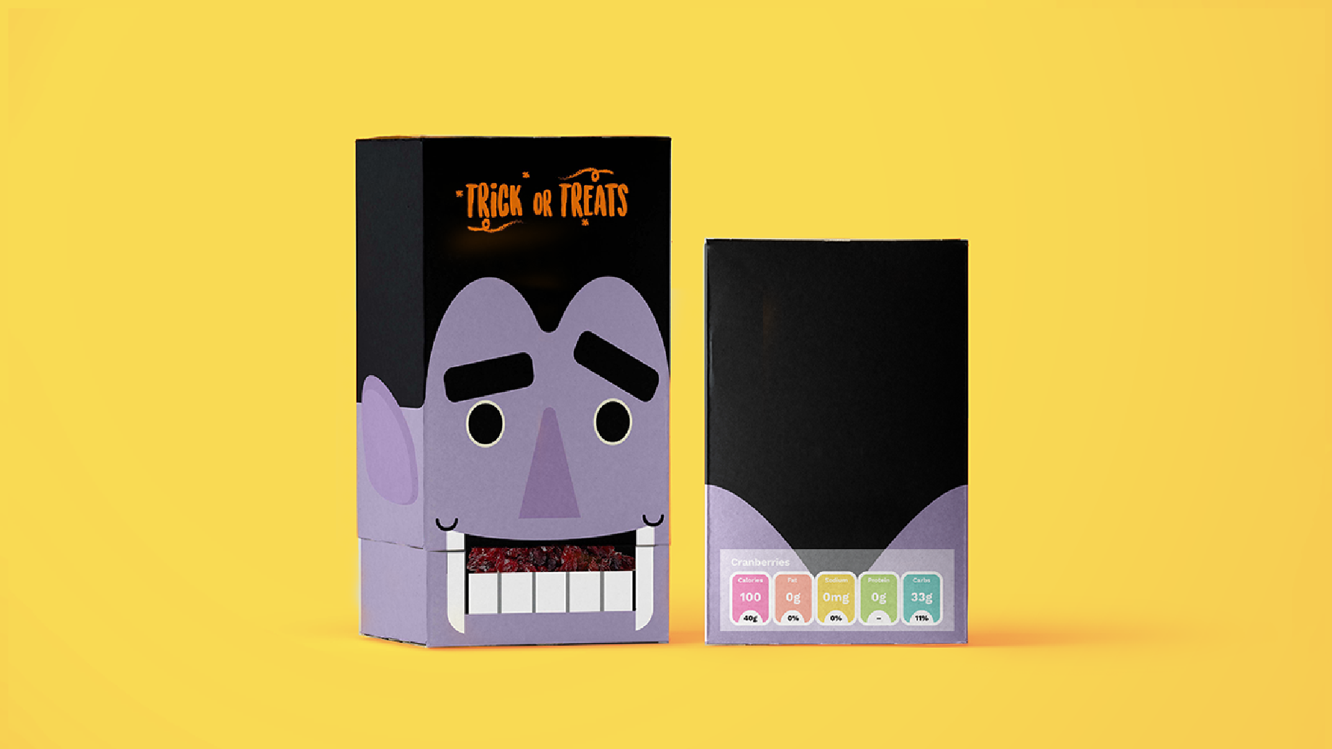
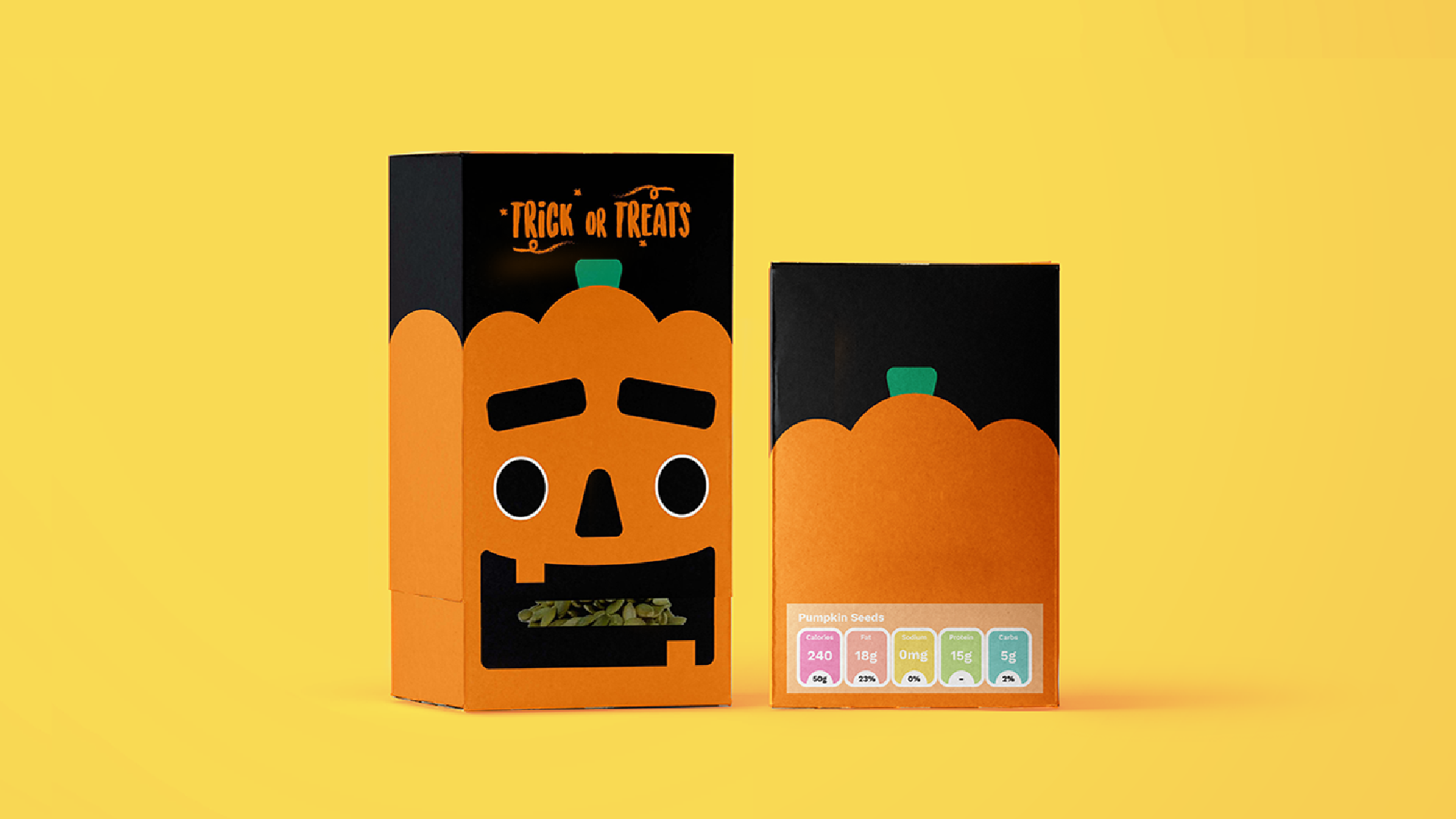
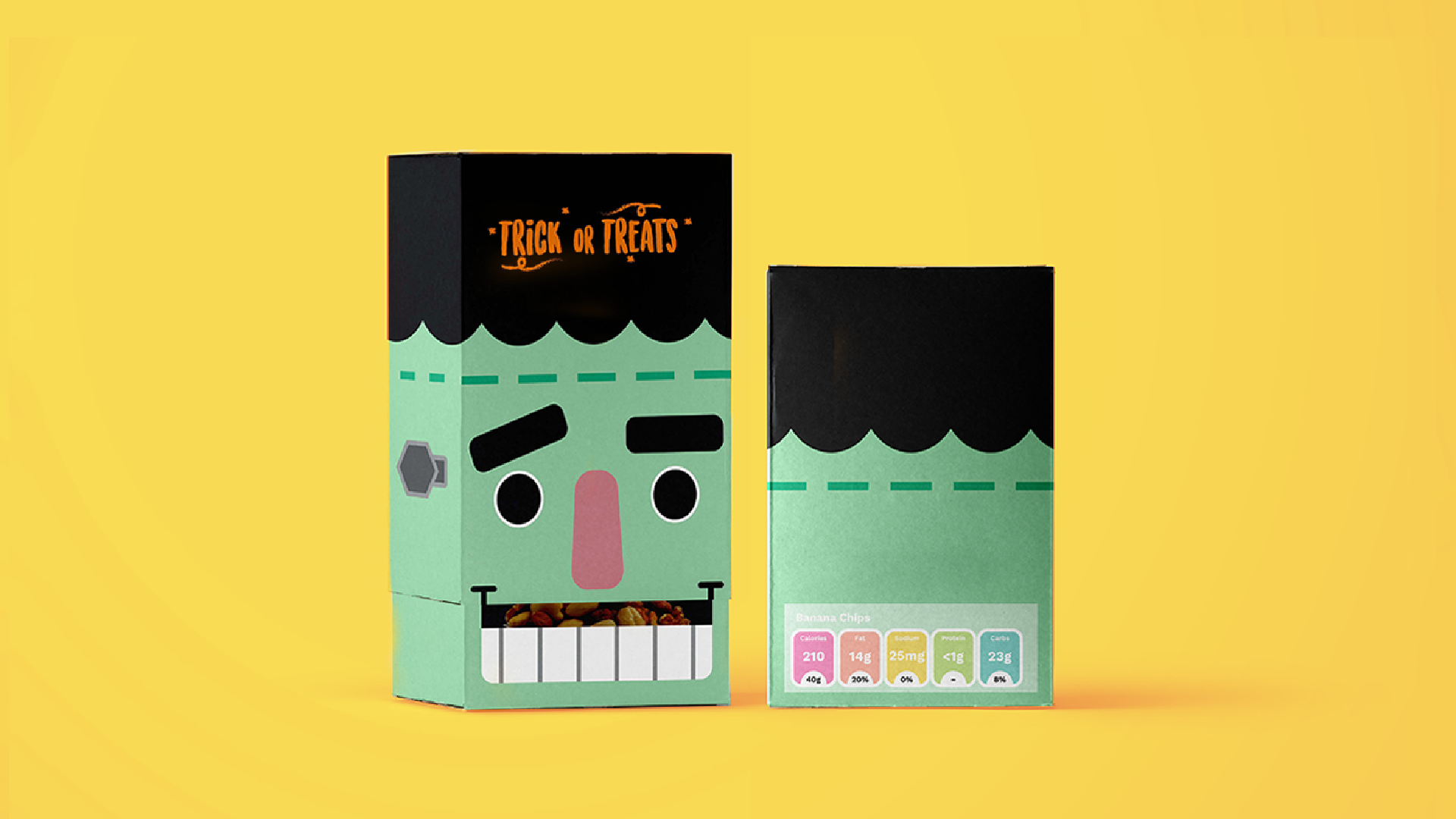
The boxes are printed with soy-based inks onto recycled card stock, assembled with natural-adhesive, and lined with food-safe tissue. Nutritional information is provided in the form of a sticker.
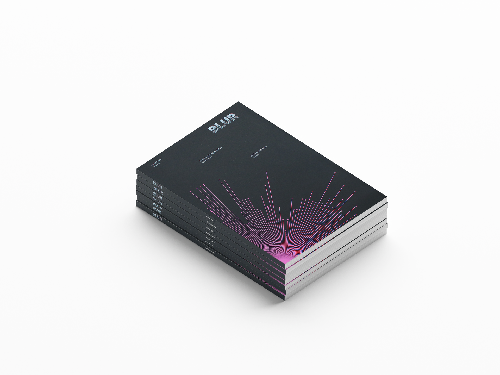
BLUR MAGAZINE
MAGAZINE BACKGROUND
'BLUR' Magazine is an biannual design magazine focused on interdisciplinary collaboration between the old and new. Targeted towards young creatives, 'BLUR' features articles, reports, reviews and interviews set to widen the perspective on what it means to design. The magazine boasts 88 pages featuring content from creators all over the world regardless of practice or language.
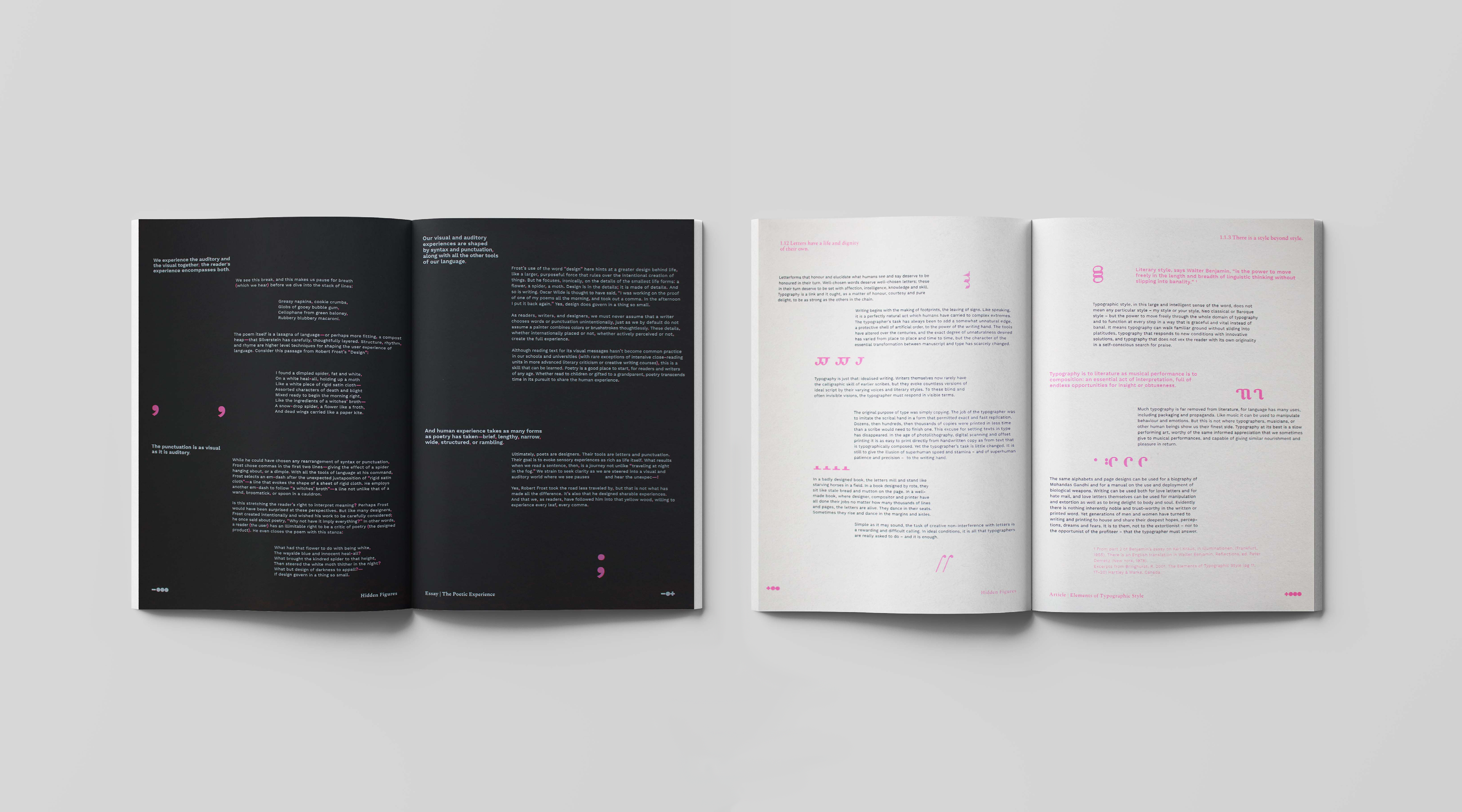
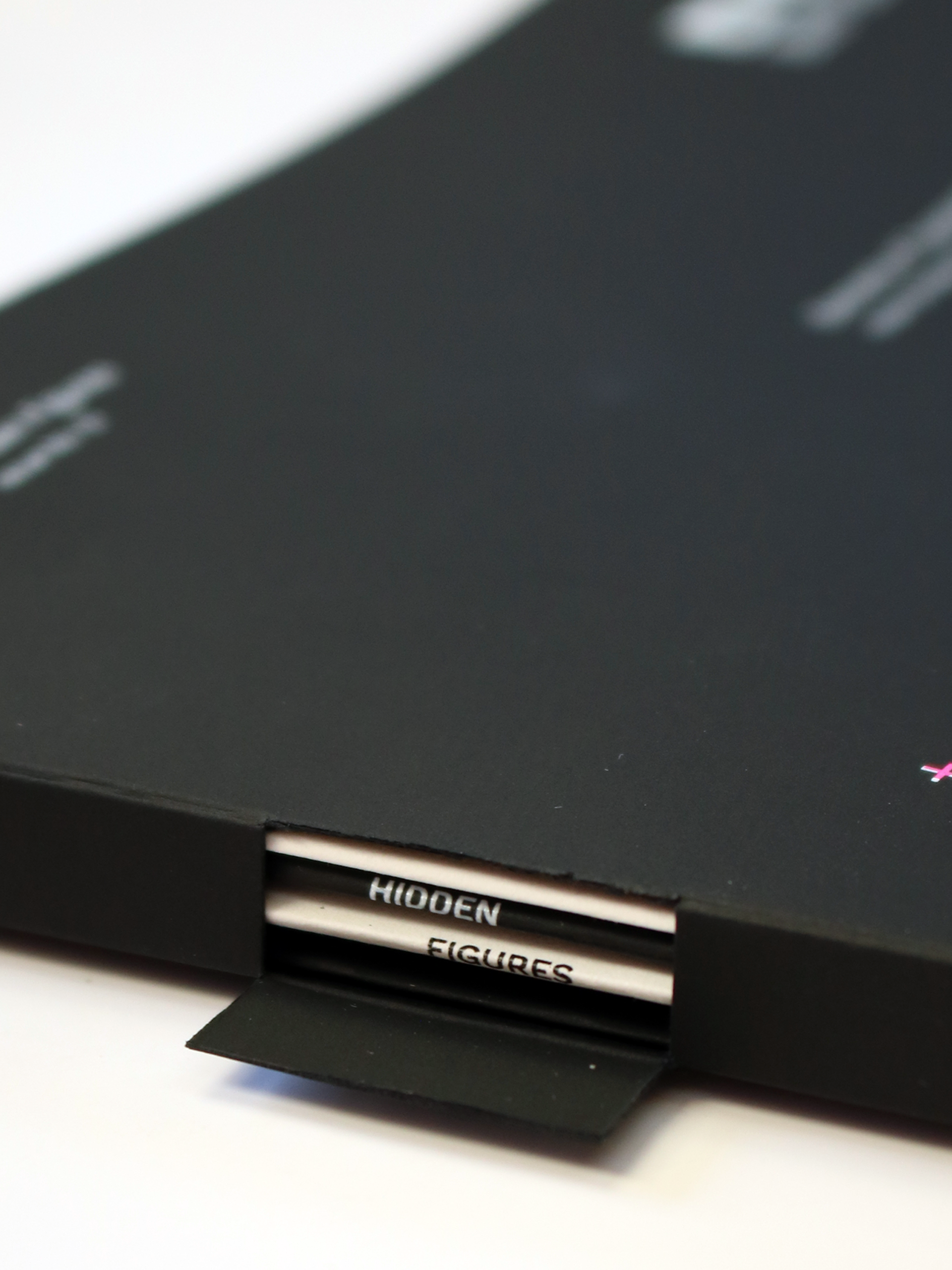
'Hidden Figures' is the 12th issue of 'BLUR' Magazine. It follows the design process of key creatives - from their intentions and methods down to their final productions. How can we spotlight the subtle forms of guidance through hidden language? We decipher the works of Robert Bringhurst and Maya P. Lim by visualising data with code and music.
This project is a Finalist in the Student Print Category awarded by the Australian Graphic Design Association (AGDA).
CONCEPT BACKGROUND
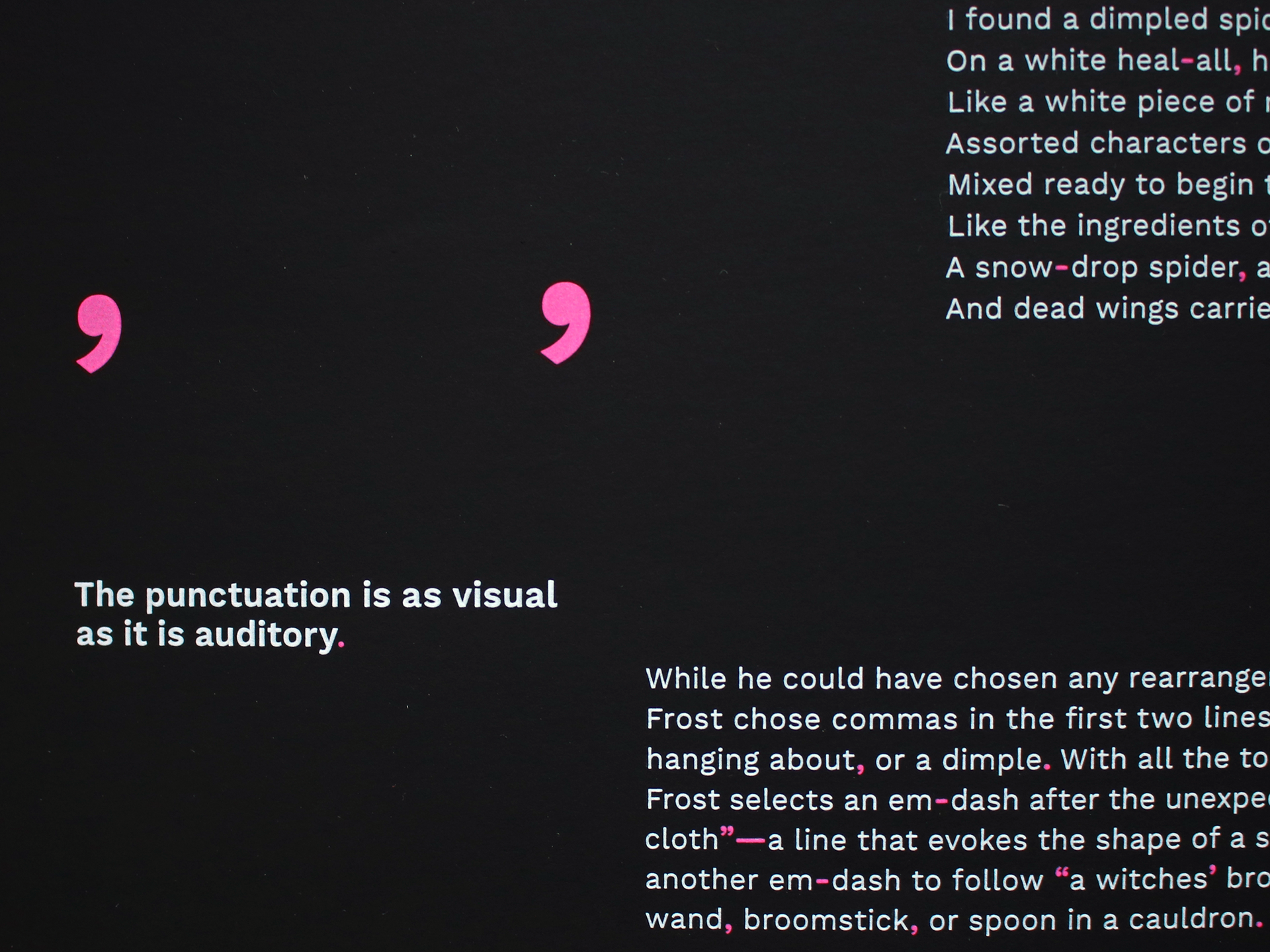
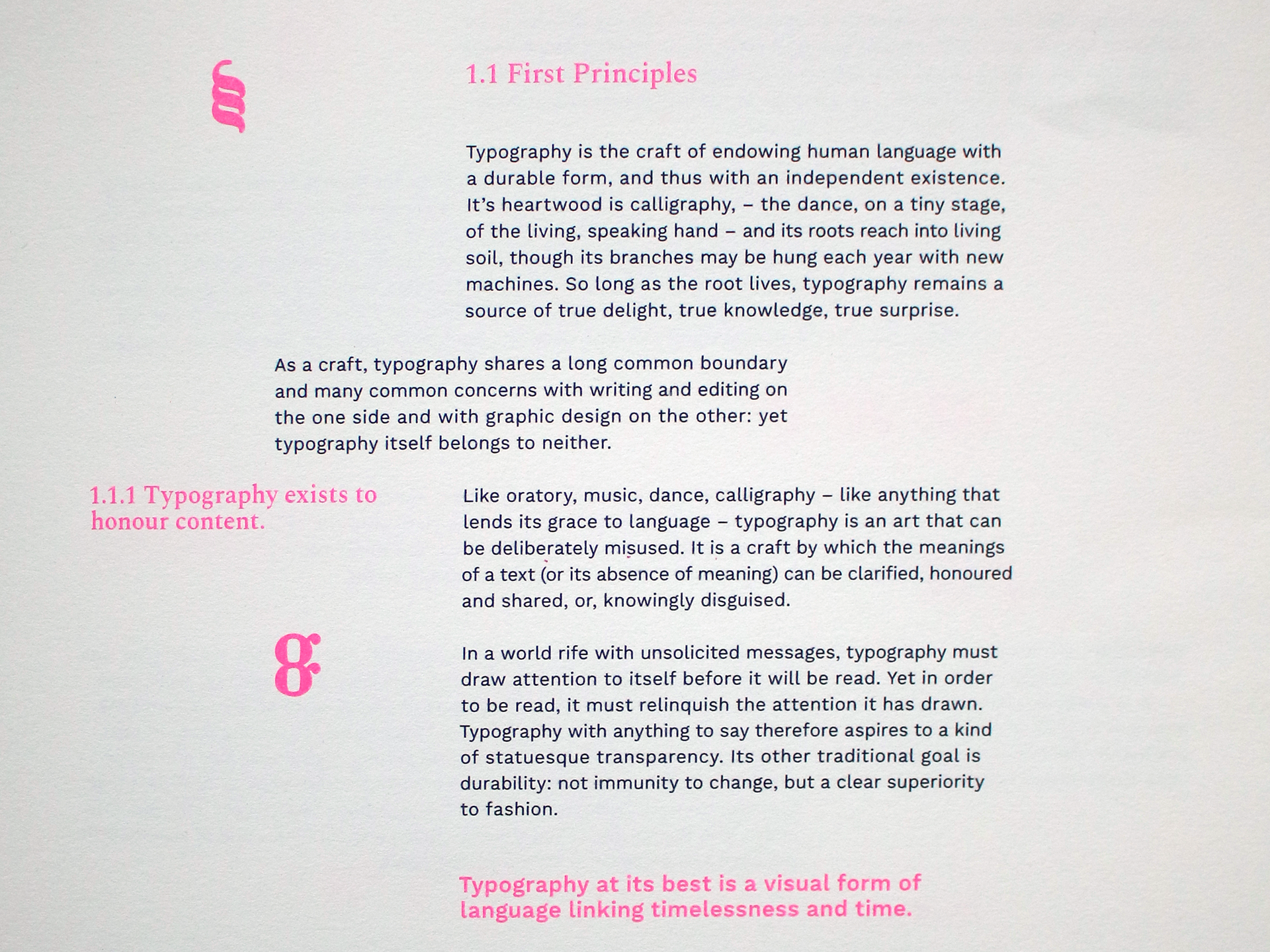
Maya P. Lim's 'The Poetic Experience' details the subtle power of punctuation in the rhythm and understanding of a text. Punctuation is highlighted through magenta on black in order to accentuate this feature. In an excerpt from Robert Bringhurst's 'The Elements of Typographic Style', typography is compared to music in the honour of content as an artform. To showcase these details, features of letterforms are spliced and repeated mimicking musical notation.
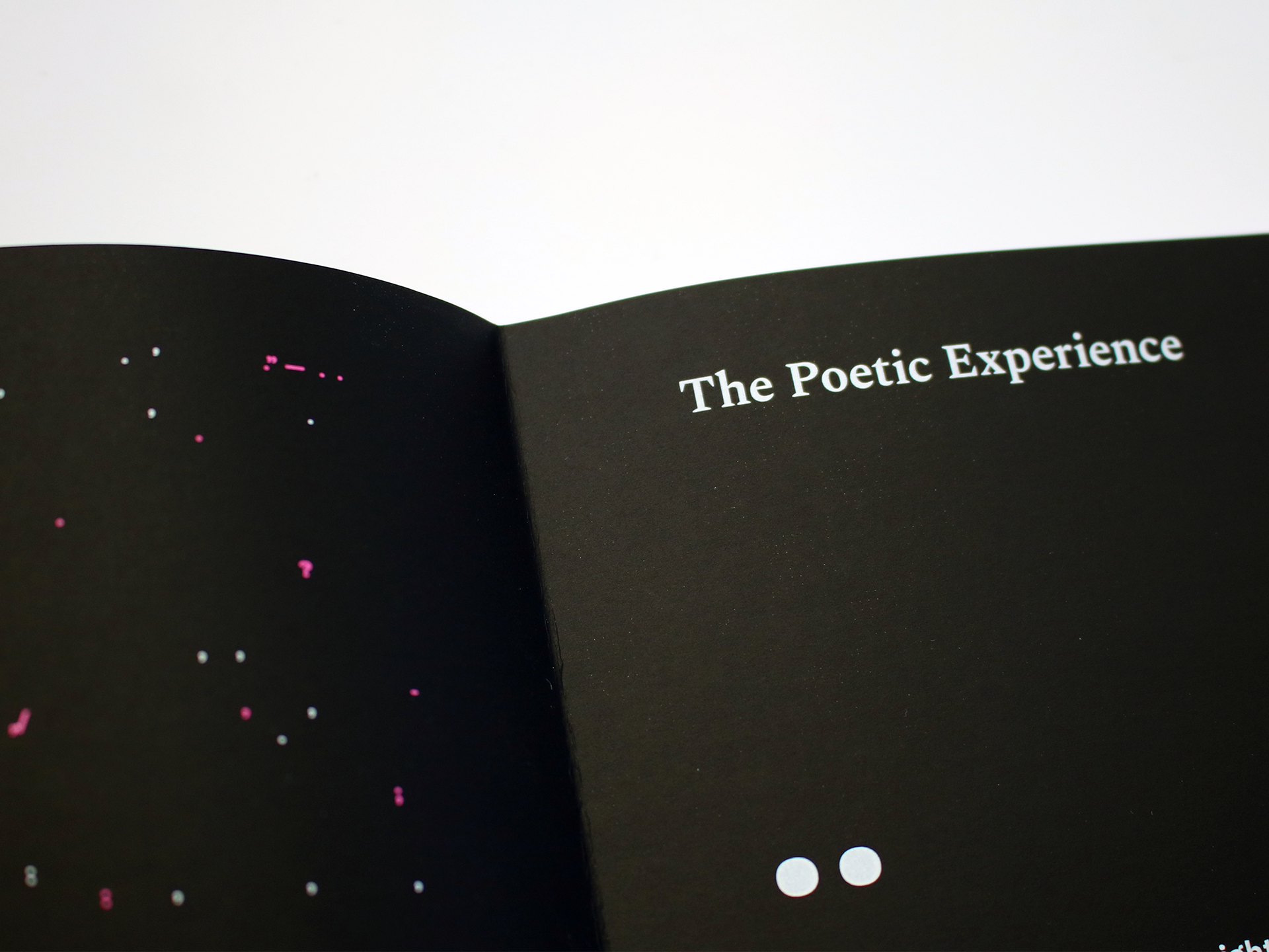
The magazine utilises spot-printing and features a cut-out at the spine revealing the title of the issue on the handbound signatures.